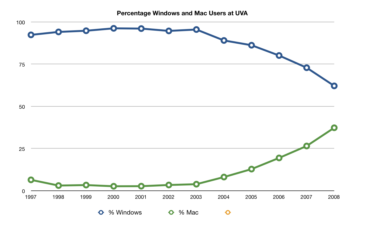
Daring Fireball has a link to the a study of the computer statistics for the student body of the University of Virginia. You can find the article here. The most interesting chart for me is the last one about the number of Macintosh users versus Windows users. The table is interesting, but I would also like to see the percentage of user population, not just the hard numbers. So here is the same data put in percentage of user base using Mac OS and Windows.
| Year | Percentage Windows | Percentage Mac | Percentage Other |
|---|---|---|---|
| 1997 | 92.51 | 6.60 | 0.89 |
| 1998 | 94.26 | 3.22 | 2.52 |
| 1999 | 94.96 | 3.51 | 1.53 |
| 2000 | 96.39 | 2.80 | 0.81 |
| 2001 | 96.24 | 2.85 | 0.91 |
| 2002 | 94.86 | 3.55 | 1.59 |
| 2003 | 95.68 | 4.03 | 2.90 |
| 2004 | 89.20 | 8.26 | 2.53 |
| 2005 | 86.38 | 12.97 | 0.65 |
| 2006 | 80.28 | 19.59 | 0.13 |
| 2007 | 73.05 | 26.66 | 0.29 |
| 2008 | 62.28 | 37.46 | 0.26 |
While the table is interesting its hard to really see the trends. The Bar charts at the original site are useful, but I found a line chart much more conclusive. It cleary shows the trend of macintosh percentage as it climbs. If you’re a fan of Windows, this might be a little disheartening as it very clearly demonstrates that while Macintosh use is on the rise, Windows use is on a significant downturn.
