Mozy is a solution for personal and professional computing backup. They will install some software on your PC to back up your machine using their remote location. I’ve had Mozy for nearly two years, and honestly, I hate it. There software brings my machine to a crawl. The backups take forever. They presets for backups don’t cover everything I want. Not to mention their desktop software just randomly stopped working. When I try to remove and reinstall it, it sill doesn’t show up. I’m sure I could spend more time looking into what is going on with the install and fix it, but honestly, I pay for this service and it should just work. I haven’t done anything crazy.
Yesterday, I got an email about Mozy redesigning their website. When I first went to check it out, the site was unavailable. Not just the page they sent me to, but the entire site, mozy.com was down. That is a real good sign from someone you trust with your data. I mean it’s not a security concern so much as a reliability concern.
When the site finally did come up, I was putt off by parts of it. One part in particular and that is what I want to talk about now. Lets talk about blue text.
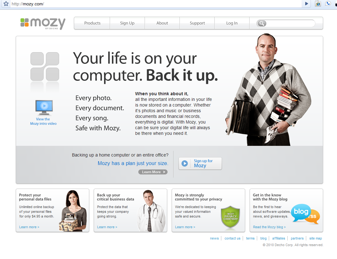
Before I get ahead of myself, here’s a screen shot of the entire site.
At first, not bad. Nothing that I think is radical about it. It wouldn’t make my list of top sites, but it is clean simple and clear. Looks like they have a good message and they are using imagery to convince me this is a personal company that wants to help.
My eye got drawn the gray box in the center of the page.
This was again, okay, because they want want me to sign up, and that is where the sign up link is. Alright. Now, I see “Mozy has a plan just for your size.” in blue text. Yes, there is a clear “Learn More”, but I see blue (highlighted) text and and I want to click on it. Granted I’m picky, but I believe if you have blue text it should be a link. Especially if you have content related to that text.
Take a second and look back at the main image. You will notice that in the boxes below, blue text does represent a link. In the “Sign up for Mozy” button, blue text is a link. In the “View the Mozy intro video” graphic in the top box, blue text is used for a link.
In this one case, blue text is just that, text. The link is right below it. This is confusing, and frustrating. I got upset and ended up not even clicking on the “Learn More”.
Why is blue text bad? Honestly, it’s legacy reasons. When the web was first recreated, links were highlighted in blue and underlined. With the introduction of CSS, many sites have switched away from blue text as a link.
Aside from legacy reasons, there is notion of consistency throughout the site. If you are going to use blue to highlight links, do it throughout the site.


